The last PPC campaign I analysed in the ‘Analyse A Real PPC Campaign’ series was from Swatch, who had created a PPC campaign for their own brand name, presumably to change the first result that appears to a unisex result, since the top organic result points to Swatch as a women’s brand of watch only. This is solidified from the slideshow on the landing page that both shows men and women’s watches.
With TV bundles and deals a big sector to capitalize on (since it will incur monthly sales), here is an analysis of a PPC campaign from Virgin TV.
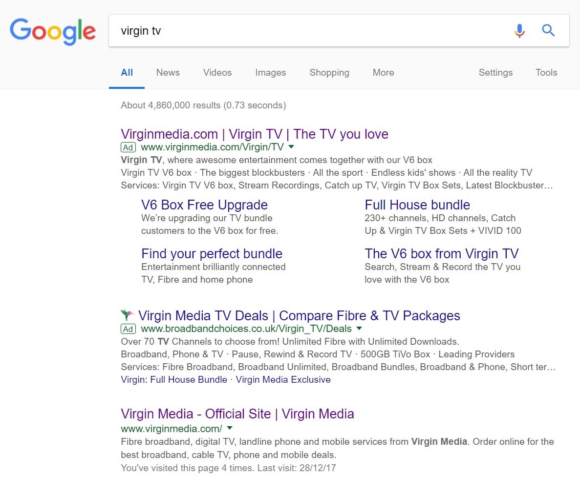
To view Virgin TV’s PPC search advert, I had to type into Google search UK, ‘Virgin TV’: Targeting their own brand name suggests that Virgin TV are not happy with their organic result, for one reason or another (considering there is zero competition for the search phrase). Possible reasons could include:
- Lack of pointing to the right page – PPC allows Virgin TV to point to whatever they page they want, with the addition of more pages using the site link extension.
- To promote something new, for which the organic result cannot do.
- To display information that the organic result does not contain.
From the above, it seems likeliest that the reason Virgin TV have a PPC campaign is for all three points, but mainly 2 and 3. There appears to be a new box that they want to advertise with new features (using the site link extensions). With this, we can assume the PPC title link will point to a designated product page for the new TV box from Virgin.
After clicking on the above advert, I came to the following landing page:
Overall, this is a very good landing page for the following reasons:
- The top section of the landing page, where the navigation menu is, is pretty much perfect. The menu hovers on expansion and allows the web user to click onto any part of Virgin media.
- Below the navigation menu are some links for which the web user will find useful, relating directly to the TV service Virgin offer. Live chat is a great addition since it is always good to speak to a human about something, if you need to ask unique questions and get answers quickly.
- The fact the product (being the new TV box) is appearing half above and below the fold gives the web user the incentive to scroll below the fold of the page, to see the rest of the image and, consequently, what else is below the fold. This provides a vertical slideshow that activates upon scrolling, of all the many reasons to go with Virgin TV for a home TV bundle system – an effective way to convince web user into a conversion.


